When selecting a house color palette, consider the architectural style and materials of your home, as these elements can influence your color choices. Research color theory principles, focusing on complementary and analogous color schemes to create visual harmony. You might want to explore historical color palettes if your home has a vintage or classic design, ensuring a cohesive look that respects its original character. Test samples in different lighting conditions, as natural and artificial light can dramatically alter how colors appear. Finally, think about the emotional impact of your chosen colors, as hues can evoke various feelings and set the overall tone for your living space.
How To Choose A House Color Palette
Consider architectural style
When selecting a house color palette, understanding your architectural style is crucial for aesthetic harmony. For example, traditional homes often benefit from classic shades like soft whites, muted earth tones, and deep greens, while modern architectural designs may allow for bolder colors such as sleek grays, vibrant blues, or even bright yellows. Incorporating complementary hues to accentuate features like shutters, doors, or trims can enhance the overall visual appeal and reflect your personal taste. Consider the surrounding environment as well, as colors that resonate with nearby landscapes or urban settings create a cohesive and inviting atmosphere for your home.
Analyze the surrounding environment
When choosing a house color palette, analyze the surrounding environment to ensure harmony with nature and nearby structures. Consider the predominant hues of your neighborhood, such as earthy tones or vibrant colors that stand out. For instance, a coastal area may benefit from light blues and sandy beiges, while a forested region could lend itself to deeper greens and browns. Your selected palette should not only complement the landscape but also enhance the architectural features of your home, creating a cohesive aesthetic that reflects its setting.
Factor in natural lighting
When selecting a house color palette, consider the impact of natural lighting throughout the day. North-facing rooms typically receive cooler light, making warmer hues like creams and soft yellows more inviting. Conversely, south-facing spaces benefit from cooler shades, such as soft blues or greens, to balance the brightness. Observing how sunlight interacts with various colors at different times can guide your choices, ensuring a harmonious aesthetic that complements your home's unique environment.
Match with roofing and accents
When selecting a house color palette, prioritize harmony with your roofing material; for instance, if your roof is dark gray, consider lighter wall colors like soft beige or pale blue that enhance the overall aesthetics. For accent colors, aim for shades that complement rather than clash with the primary color; a white trim can provide a crisp contrast against a medium-toned exterior. Explore the concept of a triadic color scheme, using three colors that are evenly spaced on the color wheel, to create visual interest without overwhelming your home's appearance. Remember, the right palette not only increases your property's curb appeal but can also impact its resale value significantly.
Evaluate neighborhood aesthetics
Evaluate the architectural styles and color trends present in your neighborhood to ensure your house complements its surroundings. Observe both historical and contemporary homes, noting common hues and materials, which will guide you in selecting a palette that harmonizes with local aesthetics. Consider how natural light affects color perception; test paint samples at different times of the day to find the most appealing shades. By aligning your house color palette with neighborhood aesthetics, you enhance property value and foster a cohesive community appearance.
Plan for future trends
When selecting a house color palette, consider timeless hues that can adapt to emerging trends over the years. Earth tones and soft neutrals are increasingly popular, offering versatility and a calming atmosphere while allowing for easy updates with accent colors. Incorporate bold, statement colors in smaller areas or accents to modernize your home without overwhelming the overall aesthetic. Your choices should reflect personal style while maintaining a balance with potential advancements in design, ensuring your home remains visually appealing in the long run.
Test with sample swatches
Start by collecting a variety of sample swatches in different color families, including warm, cool, and neutral tones, to visualize how they interact with your home's architecture and surroundings. Test your chosen colors against the natural light in different areas of your home at various times of the day to see how they change. Aim to limit your palette to three to five complementary colors for a cohesive and harmonious look, considering both the exterior and any accent features. Take photos of your swatches in situ, which will help you make an informed decision before committing to a final color choice.
Determine mood and personality
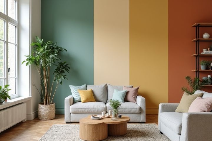
When selecting a house color palette, consider the mood and personality you wish to convey in your space. Warm colors like reds, oranges, and yellows can create an inviting and energetic atmosphere, perfect for social spaces. In contrast, cooler shades such as blues and greens promote tranquility and relaxation, making them ideal for bedrooms or home offices. Personal touches, like your favorite colors or seasonal preferences, can enhance the overall aesthetic while reflecting your individual style.
Balance light and dark hues
When choosing a house color palette, focusing on balancing light and dark hues can enhance the overall aesthetic. Light colors, such as soft neutrals and pastels, can create a sense of openness and warmth, while darker shades like navy or charcoal add depth and elegance. Consider using a combination of these hues to establish contrast, making architectural features stand out and providing visual interest. Your selected palette should embody harmony, ensuring that each color complements rather than competes with the others.
Use color theory basics
When selecting a house color palette, start by understanding the basics of color theory, which includes the color wheel, primary, secondary, and tertiary colors. Consider choosing a dominant color that reflects your personal style, complemented by a secondary color to add depth, and an accent color to create visual interest. While warm colors can evoke energy and coziness, cooler tones often promote relaxation and calmness; think about the mood you want your home to convey. Remember to test paint samples in different lighting conditions, as natural and artificial light can significantly impact how colors appear in your space.